01. introduction
01. introduction
01. introduction
Making Netflix A
Little Better
Making Netflix A
Little Better
Making Netflix A Little Better


Year
2023
My Role
UX Designer
UI Designer
Researcher
Tools
Figma
Adobe Photoshop
Adobe Illustrator
Year
2023
My Role
UX Designer
UI Designer
Researcher
Tools
Figma
Adobe Photoshop
Adobe Illustrator
Year
2023
My Role
UX Designer
UI Designer
Researcher
Tools
Figma
Adobe Photoshop
Adobe Illustrator
Overview
Overview
Netflix is incredible — until it isn’t.
Netflix is incredible — until it isn’t.
Netflix is incredible — until it isn’t.
Some days, finding something to watch feels harder than watching something itself.
Some days, finding something to watch feels harder than watching something itself.
Some days, finding something to watch feels harder than watching something itself.
And let’s be honest, none of us open Netflix thinking,
And let’s be honest, none of us open Netflix thinking,
And let’s be honest, none of us open Netflix thinking,
“I can’t wait to scroll through endless carousels today.”
“I can’t wait to scroll through endless carousels today.”
“I can’t wait to scroll through endless carousels today.”
This project originally started as a UI experiment but it didn’t take long to realise a simple truth: Pretty screens don’t fix decision fatigue.
This project originally started as a UI experiment but it didn’t take long to realise a simple truth: Pretty screens don’t fix decision fatigue.
This project originally started as a UI experiment but it didn’t take long to realise a simple truth: Pretty screens don’t fix decision fatigue.
So I put the pixels aside and picked up the research — with a mission to make Netflix feels way more
So I put the pixels aside and picked up the research — with a mission to make Netflix feels way
So I put the pixels aside and picked up the research — with a mission to make Netflix feels way more
intuitive, more personal, and far less noisy.
intuitive, more personal, and far less noisy.
intuitive, more personal, and far less noisy.
This time, the goal was simple:
This time, the goal was simple:
This time, the goal was simple:
Design an experience that feels clear, intentional, and genuinely helpful.
Design an experience that feels clear, intentional, and genuinely helpful.
Design an experience that feels clear, intentional, and genuinely helpful.
02. Understanding the problem
02. Understanding the problem
02. Understanding the problem
Why does browsing take more effort than watching?
Why Are We Still Scrolling Endlessly?
Endless scrolling isn’t the problem. Unclear choices are. Users just want a little guidance — a way to feel sure the next thing they tap is worth their time.
Endless scrolling isn’t the problem. Unclear choices are. Users just want a little guidance — a way to feel sure the next thing they tap is worth their time.

Visual noise everywhere.
Visual noise everywhere.
Visual noise everywhere.
Inconsistent spacing.
Inconsistent spacing.
Inconsistent spacing.
Icons that don’t align.
Icons that don’t align.
Icons that don’t align.
A layout that feels busy, not helpful.
A layout that feels busy, not helpful.
A layout that feels busy, not helpful.


This is Netflix,
refined.
This is Netflix,
refined.
This is Netflix,
refined.
This is Netflix,
refined.
A streaming experience that feels smoother, lighter, and more intentional.
Every screen is designed to reduce noise, guide focus, and make choosing what to watch feel effortless.
No clutter. No guesswork. Just clean design doing the work quietly.
A streaming experience that feels smoother, lighter, and more intentional.
Every screen is designed to reduce noise, guide focus, and make choosing what to watch feel effortless.
No clutter. No guesswork. Just clean design doing the work quietly.
Home,
Home,
Home,
but
but
but
calmer.
calmer.
calmer.
From cluttered to considered.
From cluttered to considered.
Better spacing. Easier to scan. Cleaner rows.
Better spacing. Easier to scan. Cleaner rows.
Better spacing. Easier to scan. Cleaner rows.
Faster
Faster
Faster
choices.
choices.
choices.

One menu that brings
One menu that brings
One menu that brings
order to the chaos.
order to the chaos.
order to the chaos.
Your shows, movies, downloads, and watched list — all neatly grouped. Clarity starts here.
Your shows, movies, downloads, and watched list — all neatly grouped. Clarity starts here.

Content Page, rethought.
Content Page, rethought.
Content Page, rethought.
Everything you need, exactly where you expect it — from ratings to episodes to details. A content page designed to help you decide faster, without the overwhelm.
Everything you need, exactly where you expect it — from ratings to episodes to details. A content page designed to help you decide faster, without the overwhelm.
Less clutter.
Less clutter.
Less clutter.
More
More
More
clarity.
clarity.
clarity.
Less clutter. More clarity. Everything you need, exactly where you look.
Less clutter. More clarity. Everything you need, exactly where you look.
Info is now arranged in
Info arranged in a
Info is arranged in
a cleaner
cleaner
a cleaner
vertical
vertical
vertical
flow.
flow.
flow.

IMDb ratings right
IMDb ratings right
IMDb ratings right
where they
where they
where they
matter.
matter.
matter.
No more switching between apps.
No more guesswork.
No more switching between apps.
No more guesswork.

Downloads, redesigned.
Downloads,
redesigned.
From long-press actions to progress indicators — every state is cleaner, more readable, and easier to act on.
Downloads you
Downloads you
Downloads you
don’t have to
don’t have to
don’t have to
babysit.
babysit.
babysit.
Offline viewing that finally feels intentional.
Offline viewing that finally feels intentional.

Stacked with
Stacked with
Stacked with
purpose.
Your shows, movies, downloads, and watched list — all neatly grouped. Clarity starts here.
Your shows, movies, downloads, and watched list — all neatly grouped. Clarity starts here.

Download states
Download states
Download states
reinvented.
reinvented.
reinvented.
Clear, visual feedback for every moment.
Clear, visual feedback for every moment.

Menu,
simplified.
Menu,
simplified.
Menu,
simplified.
No more digging through tabs or guessing where things live. This redesigned menu brings all your essentials together — clean, organized, and effortless to navigate.
No more digging through tabs or guessing where things live. This redesigned menu brings all your essentials together — clean, organized, and effortless to navigate.

Designed to
Designed to
Designed to
feel
feel
feel
lighter.
lighter.
lighter.
Fewer distractions. More breathing room. A menu that lets you think less and watch more.
Designed for how you
Info arranged in a
Info is arranged in
actually browse.
actually browse.
actually browse.
Because finding things shouldn’t feel like guesswork.
Because finding things shouldn’t feel like guesswork.

Your entire library,
Your entire library,
Your entire library,
one
one
one
tap
tap
tap
away.
away.
away.
A simple menu that helps you browse with purpose, not wander in circles.
A simple menu that helps you browse with purpose, not wander in circles.

03. Methodology
03. Methodology
Listening Before
Designing
Listening Before
Designing
Surveys &
Interviews
Surveys &
Interviews
Surveys & Interviews
To understand why Netflix feels harder to browse than it should, I spoke with real viewers about how they discover content, decide what to watch, and manage the growing noise inside the app. What I found was that struggle wasn’t entertainment — it was clarity.
To understand why Netflix feels harder to browse than it should, I spoke with real viewers about how they discover content, decide what to watch, and manage the growing noise inside the app. What I found was that struggle wasn’t entertainment — it was clarity.
Seven participants
(ages 19–34)
The participants included a college student, a film enthusiast, two busy working professionals, a UX designer, a long-time Netflix loyalist, and a casual weekend watcher—capturing both frequent and occasional streaming behaviour.
1
Too many titles. Too little direction.
Endless rows made it hard for users to narrow choices and commit to something worth watching. something worth watching.
1
Too many titles. Too little direction.
Endless rows made it hard for users to narrow choices and commit to something worth watching. something worth watching.
1
Too many titles. Too little direction.
Endless rows made it hard for users to narrow choices and commit to something worth watching. something worth watching.
1
Too many titles. Too little direction.
Endless rows made it hard for users to narrow choices and commit to something worth watching. something worth watching.
2
“I’ve already seen this.”
Repeated content surfaced often, making discovery feel generic and far less personal.
2
“I’ve already seen this.”
Repeated content surfaced often, making discovery feel generic and far less personal.
2
“I’ve already seen this.”
Repeated content surfaced often, making discovery feel generic and far less personal.
2
“I’ve already seen this.”
Repeated content surfaced often, making discovery feel generic and far less personal.
3
“Hide what I’m done with.”
Many wanted a way to remove watched titles so their homepage reflected only fresh, relevant options.
3
“Hide what I’m done with.”
Many wanted a way to remove watched titles so their homepage reflected only fresh, relevant options.
3
“Hide what I’m done with.”
Many wanted a way to remove watched titles so their homepage reflected only fresh, relevant options.
3
“Hide what I’m done with.”
Many wanted a way to remove watched titles so their homepage reflected only fresh, relevant options.
4
Filters weren’t helping.
Users wanted deeper sorting options — genres, ratings, languages — to refine recommendations with real precision.
4
Filters weren’t helping.
Users wanted deeper sorting options — genres, ratings, languages — to refine recommendations with real precision.
4
Filters weren’t helping.
Users wanted deeper sorting options — genres, ratings, languages — to refine recommendations with real precision.
4
Filters weren’t helping.
Users wanted deeper sorting options — genres, ratings, languages — to refine recommendations with real precision.
5
No built-in guidance.
The lack of integrated ratings or decision-making tools made people second-guess their choices.
5
No built-in guidance.
The lack of integrated ratings or decision-making tools made people second-guess their choices.
5
No built-in guidance.
The lack of integrated ratings or decision-making tools made people second-guess their choices.
5
No built-in guidance.
The lack of integrated ratings or decision-making tools made people second-guess their choices.
6
Discovery felt like work.
Without a smarter way to surface content that matched their moment, users slipped into endless scrolling and frustration.
6
Discovery felt like work.
Without a smarter way to surface content that matched their moment, users slipped into endless scrolling and frustration.
6
Discovery felt like work.
Without a smarter way to surface content that matched their moment, users slipped into endless scrolling and frustration.
6
Discovery felt like work.
Without a smarter way to surface content that matched their moment, users slipped into endless scrolling and frustration.
Conclusion
Conclusion
The research revealed consistent pain points: overwhelming choice, lack of trustworthy in-app information, generic recommendations, limited filtering control, and a browse-heavy experience that feels more like work than entertainment. These insights informed the problem definition and clarified the design direction—centering on IMDb integration, advanced filters, and tools to keep recommendations fresh and personalised.
Affinity Mapping
Affinity Mapping
Affinity Mapping
Making Sense Of
The Data
Making Sense Of
The Data
Making Sense Of The Data
After conducting user interviews and surveys, I organised all qualitative insights using affinity mapping. Affinity mapping allowed me to move from scattered user comments to clear, evidence-backed opportunity areas.
So I put the pixels aside and picked up the research — with a mission to make Netflix feels way
After conducting user interviews and surveys, I organised all qualitative insights using affinity mapping. Affinity mapping allowed me to move from scattered user comments to clear, evidence-backed opportunity areas.

Insights that
shaped everything.
Insights that
shaped everything.
The patterns behind the problems —
made clear, so the design could make sense.
So I put the pixels aside and picked up the research — with a mission to make Netflix feels way
The patterns behind the problems — made clear, so the design could make sense.

Decision fatigue, unpacked. Too many look a like titles made choices harder, not easier. Users needed clearer signals and not more scrolling and repeated recommendations.

Missing context means missing confidence. Without trusted in-app ratings or quality cues, users were forced to pause, switch apps, and double-check elsewhere. Every detour brakes the flow and the moment.

When discovery slows, interest drops. Weak filters and broad categories made finding the right show unnecessarily hard. Users want results shaped by mood, language, and relevance not just algorithmic guesswork.
User personas
User personas
From Research
to Empathy
From Research
to Empathy
From Research to Empathy
The research truly came alive when I met the real people behind the numbers. Three vivid user archetypes emerged—each with unique habits, frustrations, and motivations. Knowing who feels the pain is just as crucial as knowing where it hurts.
The research truly came alive when I met the real people behind the numbers. Three vivid user archetypes emerged—each with unique habits, frustrations, and motivations. Knowing who feels the pain is just as crucial as knowing where it hurts.

Marcus
Age
22
Profession
College Student
Location
Berlin
pain Points
Gets overwhelmed by content which makes it hard to decide what to watch.
Frequently sees shows he has already finished or abandoned, making the homepage feel repetitive.
User Needs
A quick, in-app way to judge whether a show is worth watching without leaving Netflix.
A cleaner, more dynamic homepage that updates based on his real watch history.
Design Implications
Integrate IMDb ratings directly into the UI to reduce external app switching.
Add a “Hide Watched Content” feature to declutter the browsing experience.
Amy
Age
30
Profession
Marketing
Location
Dublin
pain Points
Feels current filters are too generic, making it hard to narrow down options to her preferences.
Gets frustrated when recommendations feel repetitive or not tailored to her viewing habits.
User Needs
Comprehensive filters that help her refine results by ratings, genre, audio & subtitle language options.
Recommendations that stay fresh, relevant, and aligned with her viewing history.
Design Implications
Expand Netflix’s filter system to support advanced and detailed criteria.
Improve recommendation logic to surface personalised content while avoiding redundancy.
04. Design Discovery
04. Design Discovery
The Art of Reduction
The Art of Reduction
The Art of Reduction
The Art of Reduction
In this discovery sprint, I focused on stripping away noise and elevating clarity. By grounding decisions in research and testing early concepts, I ensured the redesign remained intuitive, user-friendly, and aligned with real viewing behaviours. The goal wasn’t to reinvent Netflix — it was to make it feel lighter, smarter, and more predictable.
Discovery
Sprint 1
Discovery
Sprint 1
Discovery Sprint 1
This sprint was all about stripping things back —
This sprint was all about stripping things
This sprint was all about stripping things back —
back —
turning complexity into clarity.
turning complexity into clarity.
turning complexity into clarity.
By testing early ideas and cutting anything that created friction, I built a direction that feels more
By testing early ideas and cutting anything that created friction, I built a direction that
By testing early ideas and cutting anything that created friction, I built a direction that feels more
feels more
intuitive, more predictable, and far less work for the user.
intuitive, more predictable,
intuitive, more predictable, and far less work for the user.
and far less work for the user.
Outcomes
Outcomes
Surveys & Interviews
Clarity — Reducing noise and improving decision-making.
Control — Empowering users with meaningful filters and tools.
Consistency — Establishing predictable interaction patterns.
Clarity — Reducing noise and improving decision-making.
Control — Empowering users with meaningful filters and toggles
Consistency — Establishing predictable interaction patterns
This sprint aligned the redesign around three essentials:
Clarity — Reducing noise and improving decision-making.
Control — Empowering users with meaningful filters and toggles
Consistency — Establishing predictable interaction patterns
This sprint aligned the redesign around three essentials:
Clarity — Reducing noise and improving decision-making.
Control — Empowering users with meaningful filters and toggles
Consistency — Establishing predictable interaction patterns
UX Strategy
UX Strategy
UX Strategy
Hick's Law
Less to process. Faster to choose.
By reducing clutter and surfacing clearer signals (IMDb badge), decisions become quicker and browsing becomes less existential.
Jakob's Law
Familiar patterns = zero learning curve.
Bottom sheets, clean menus, predictable layouts — everything works the way users expect, so the redesign feels intuitive from the first tap.
Occam's Razor
Simplify until it just makes sense.
A single filter sheet. A single toggle. A single rating badge. No over-designing — just removing friction until the experience feels effortless.
Aesthetic–Usability Effect
Look good, feel easy.
A cleaner hierarchy and more breathing room instantly make Netflix feel friendlier, calmer, and less overwhelming — boosting perceived usability.
Low-Fidelity Wireframes
Low-Fidelity Wireframes
The First Clues of Clarity
The First Clues of Clarity
The First Clues of Clarity
These explorations formed the backbone of the final design — focused, intentional, and easier to navigate.
So I put the pixels aside and picked up the research — with a mission to make Netflix feels way
These explorations formed the backbone of the final design — focused, intentional, and easier to navigate.


Design concepts
Design concepts
Bringing the Vision
Into Focus
Bringing the Vision
Into Focus
Bringing the Vision
Into Focus
The early concepts evolved into refined interactions, visual clarity, and feature behaviors that finally feel Netflix-native. Users don’t need more content. They need better guidance. They need less noise. They need confidence. And that’s exactly what these enhancements deliver.
So I put the pixels aside and picked up the research — with a mission to make Netflix feels way
The early concepts evolved into refined interactions, visual clarity, and feature behaviors that finally feel Netflix-native. Users don’t need more content. They need better guidance. They need less noise. They need confidence. And that’s exactly what these enhancements deliver.
Hide Watched Content
Decision Fatigue from Overwhelming & Repetitive Content
Hide Watched Content
A tiny toggle with a massive impact. Finished shows fade away, and your homepage becomes instantly fresher, cleaner, and far more you. One tap, less clutter, more relevance.
A tiny toggle with a massive impact. Finished shows fade away, and your homepage becomes instantly fresher, cleaner, and far more you. One tap, less clutter, more relevance.

Advanced Filters
Decision Fatigue from Overwhelming & Repetitive Content
Advanced Filters
Filters that finally feel effortless. Genres, ratings, audio, subtitles — all grouped cleanly, designed to scan quickly, and easy to trust. What you want isn’t buried anymore. It’s right where you think it should be.
Filters that finally feel effortless. Genres, ratings, audio, subtitles — all grouped cleanly, designed to scan quickly, and easy to trust. What you want isn’t buried anymore. It’s right where you think it should be.

IMDb Integration
Decision Fatigue from Overwhelming & Repetitive Content
IMDb Integration
A subtle badge, a major upgrade. IMDb ratings are now built in — no app-switching, no guessing. Decisions become faster, browsing becomes calmer, and confidence stays uninterrupted.
A subtle badge, a major upgrade. IMDb ratings are now built in — no app-switching, no guessing. Decisions become faster, browsing becomes calmer, and confidence stays uninterrupted.

05. Design enhancements
05. Design enhancements
Refining What Matters
Refining What Matters
Refining What Matters
Refining What Matters
In this discovery sprint, I focused on stripping away noise and elevating clarity. By grounding decisions in research and testing early concepts, I ensured the redesign remained intuitive, user-friendly, and aligned with real viewing behaviours. The goal wasn’t to reinvent Netflix — it was to make it feel lighter, smarter, and more predictable.
Discovery
Sprint 2
Discovery
Sprint 2
Discovery Sprint 2
In this sprint, the focus shifted from spotting
In this sprint, the focus shifted from
In this sprint, the focus shifted from
experience.
problems to
spotting problems to
spotting problems to
elevating the experience.
elevating the
elevating the
experience.
Less noise. More flow. Small, intentional
Less noise. More flow. Small, intentional
Less noise. More flow. Small, intentional
interventions that make Netflix feel
interventions that make Netflix feel
interventions that make Netflix feel
lighter, smarter,
lighter
and a lot less work to use.
, smarter, and a lot less work to use.
lighter and a lot less work to use.
What I Refined
What I Refined
Surveys & Interviews
Navigation that makes sense — clearer paths, fewer surprises.
Decisions that happen faster — cleaner layouts & real signals like IMDb.
A more intuitive rhythm — predictable flows, calmer visuals.
Navigation that makes sense — clearer paths, fewer surprises.
Decisions that happen faster — cleaner layouts & real signals like IMDb.
A more intuitive rhythm — predictable flows, calmer visuals.
This sprint aligned the redesign around three essentials:
Clarity — Reducing noise and improving decision-making.
Control — Empowering users with meaningful filters and toggles
Consistency — Establishing predictable interaction patterns
This sprint aligned the redesign around three essentials:
Clarity — Reducing noise and improving decision-making.
Control — Empowering users with meaningful filters and toggles
Consistency — Establishing predictable interaction patterns
Every screen, unified under one goal — clarity.
Every screen, unified under one goal — clarity.
Every screen, unified under one goal — clarity.
A browsing experience that finally feels effortless.
A browsing experience that finally feels effortless.
A browsing experience that finally feels effortless.
Focused, Fast, and Finally Intuitive
Focused, Fast, and Finally Intuitive
Three Problems. Three Fixes.
Three Problems. Three Fixes.
Three Problems. Three Fixes.
Three Problems. Three Fixes.
01
IMDb Integration
A tiny badge that saves you from switching apps. Again.
Built-in ratings that help you decide faster, with zero tab-juggling.
01
IMDb Integration
A tiny badge that saves you from switching apps. Again.
Built-in ratings that help you decide faster, with zero tab-juggling.
01
IMDb Integration
A tiny badge that saves you from switching apps. Again.
Built-in ratings that help you decide faster, with zero tab-juggling.
01
IMDb Integration
A tiny badge that saves you from switching apps. Again.
Built-in ratings that help you decide faster, with zero tab-juggling.
Timed cover carousel
with all the cool
artwork.
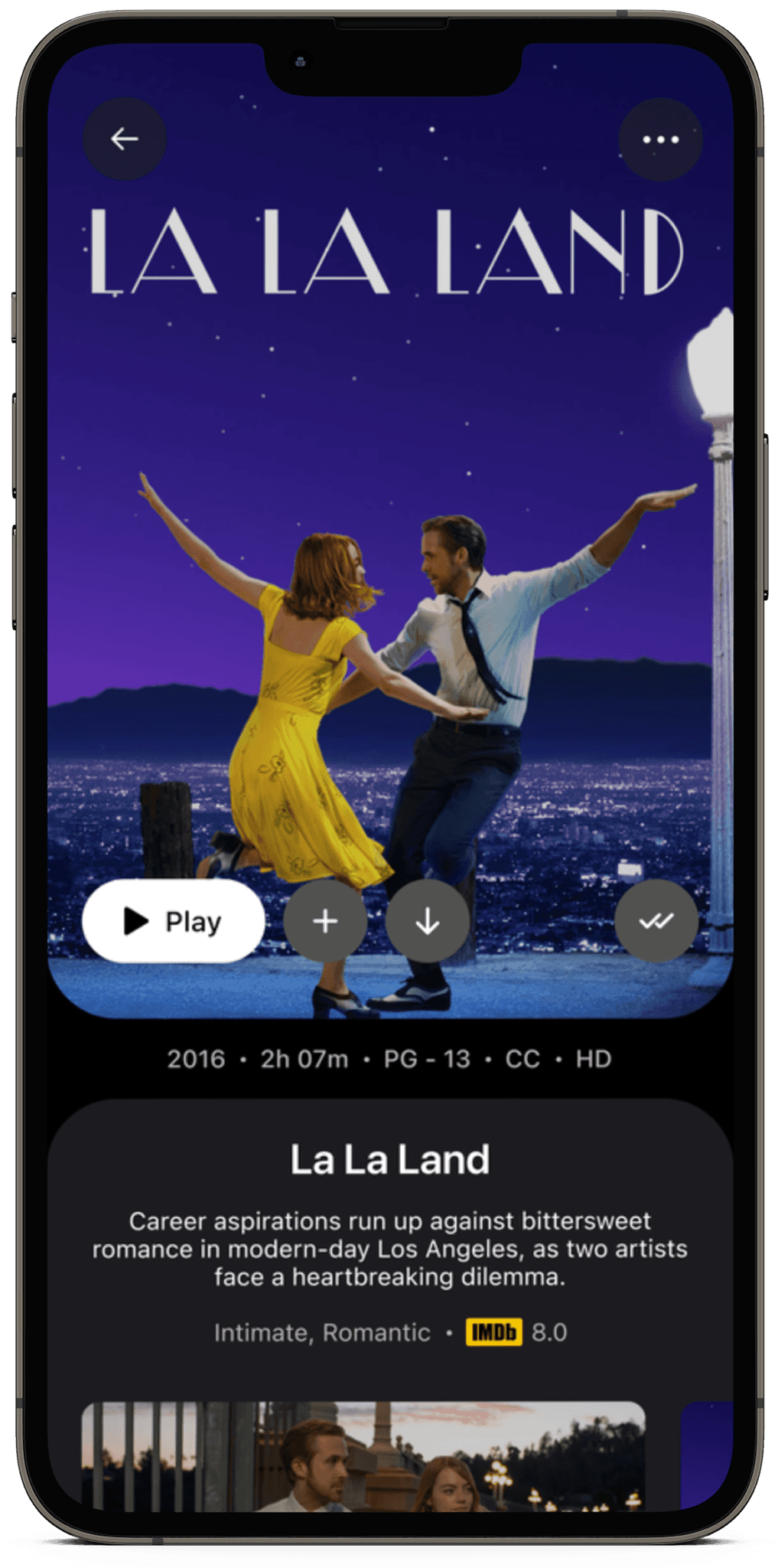
IMDb Integration
To help you decide if
you should watch the
content or not.
Timed cover carousel
with all the cool
artwork.
IMDb Integration
To help you decide if
you should watch the
content or not.
Timed cover carousel
with all the cool
artwork.
IMDb Integration
To help you decide if
you should watch the
content or not.
Timed cover carousel
with all the cool
artwork.
IMDb Integration
To help you decide if
you should watch the
content or not.